Intro
In 2017, my product manager and I were reviewing our strategy for the future of the apps as we went through user feedback it became apparent that our biggest customer issue was the impossibility to purchase more than 1 item at a time. Wait… what?
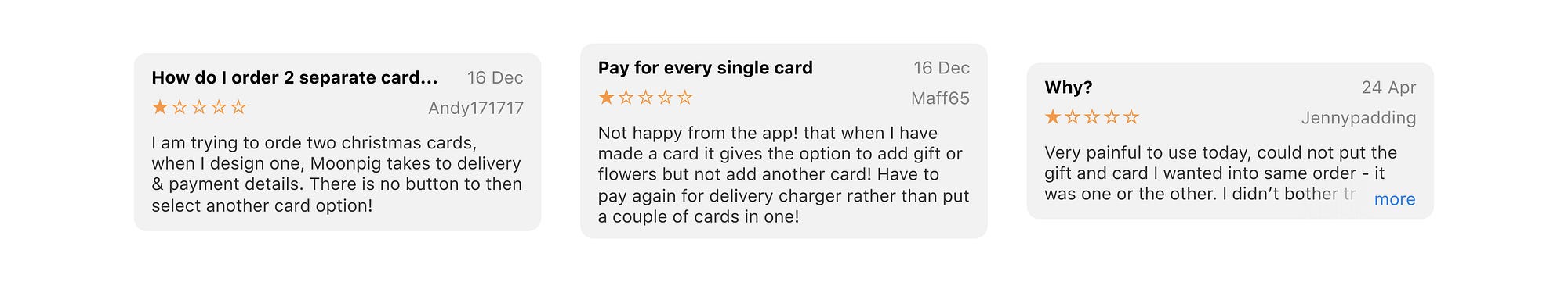
"Painful but useful reviews"
Our service is a complexly built system within most parts — the customer in mind, coupled with an extremely lean culture, minimising product increments to the bare minimum, using behavioral data proxied from 15 years of online card sales. As our OKR at the time was to move the app average order value (AOV) needle, we knew that resolving the number one customer complaint had to become the priority.
The context
The app was brought back in-house several years ago and was built by an agency focusing on our USP: personalised cards. As the company strategy evolved, as well as the product offering, the customer journey had had to be adapted but never rebuilt to scale. Flowers and gifts had been added, becoming not only a card retailer but a destination for celebrating special moments. This was all great, but from a digital product perspective, our app was falling apart. Our customers' expectations had completely out scaled our product and it was starting to make a lot of noise.
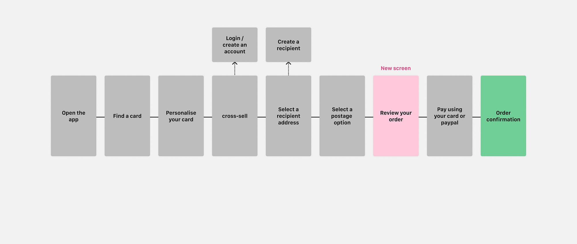
The journey on the app at the time was as follow:
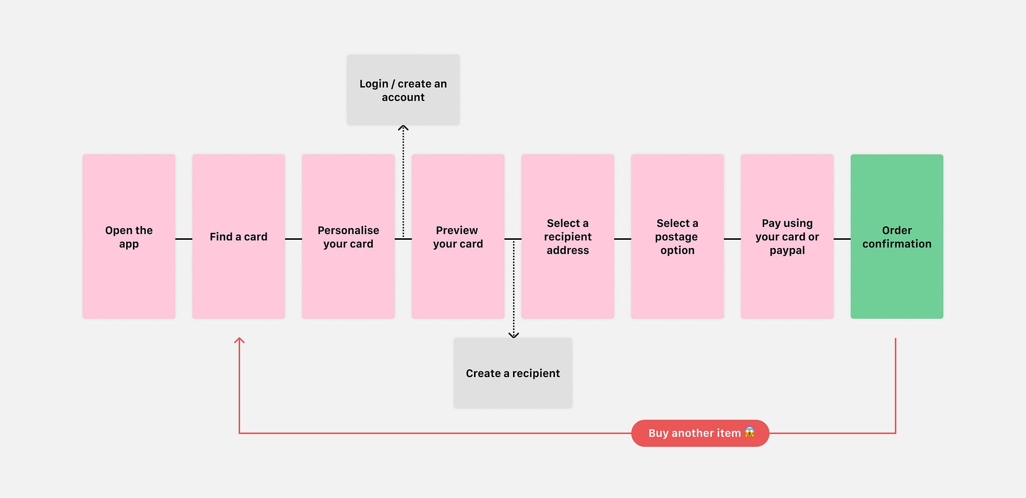
"Customer journey before"
As a non-user, you might say that doesn't seem too bad? (And you are right) . Most of our customers were happy with this journey. A single linear card purchase flow, for a single occasion in mind. No less, no more. As this experience had been designed to serve a specific persona, a lot of scenarios had been avoided and did not allow users to achieve their adjacent tasks.
- What if I need to go out of the app whilst designing my card?
- What if I'm taking a lot of time to purchase my card?
- What if I get interrupted by a phone call?
- What if I lose my connection when I'm on the tube?
- What if I want to try several options?
- What if I need three cards?
So many missions an e-commerce app should look into.
We identified two major user pain points
- If you leave the app before checking out, you will lose everything you've done.
- If you want to buy more than one item, you have to place each order separately. This means more shipping costs, more orders, more troubles.
From a customer point of view, this is not acceptable and that's why we were resolved to fix it. From a business point of view, it was a different story… This specific journey — although identified as a major customer pain point— had the highest conversion rate we had ever seen for an online retailer.
"Over 40%" Something the business would not let go easily.
In a stakeholders meeting:
Us: how much of our conversion rate can we trade-off for a higher average order value?
Stakeholders: "none"

"Not sure what to say…"
This business position had a massive impact on the release strategy of our project, but we were going to try our best to succeed
Our goal was now: Allow customers to buy as many items as they want in a single transaction, whilst not impacting conversion rate…
Empathise
First thing first, there was an initial immersing phase around the platform. I spent days searching, reading, questioning, and mapping how the whole tech was working. Defining the business logic behind. Then started investigating competitors and listing functionalities our customers should expect from a typical e-commerce shopping cart on day first release.
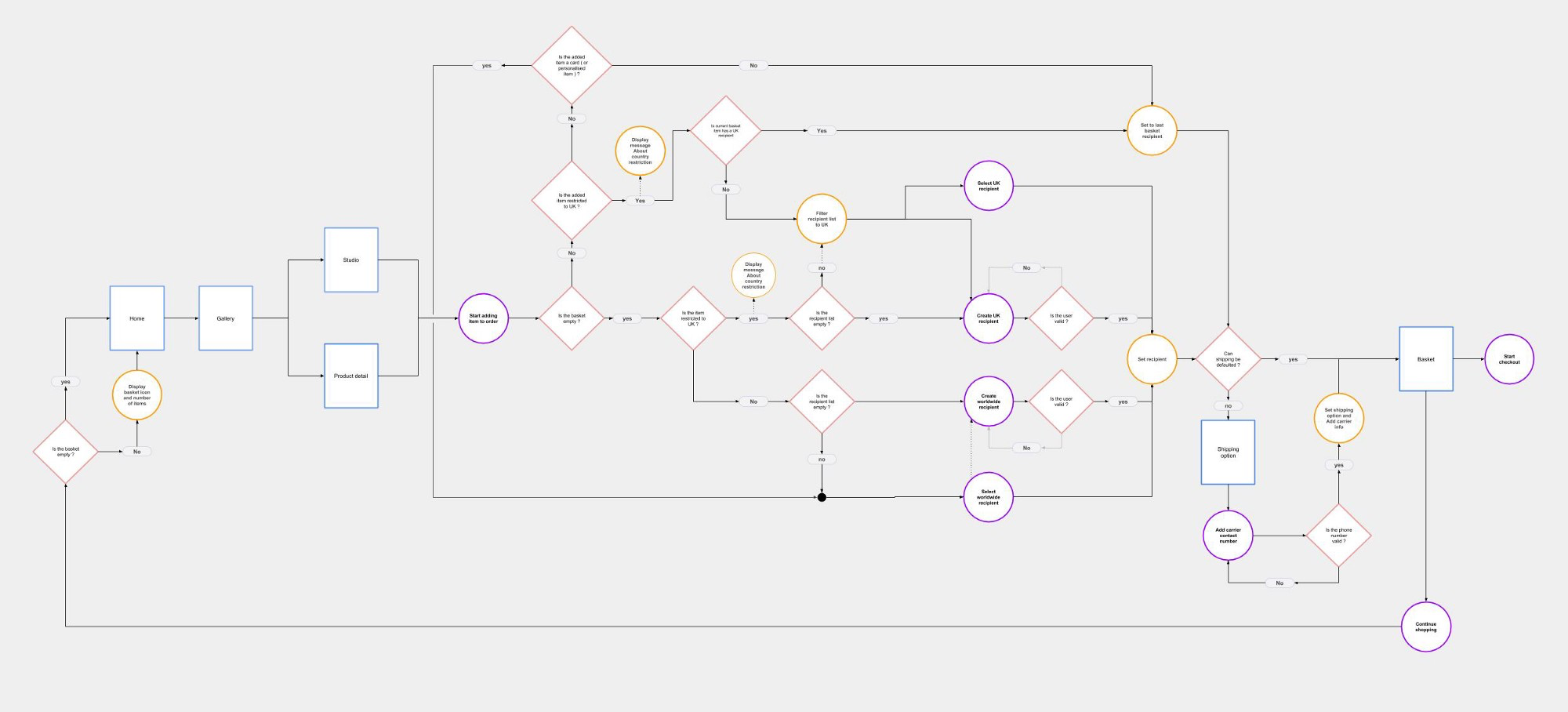
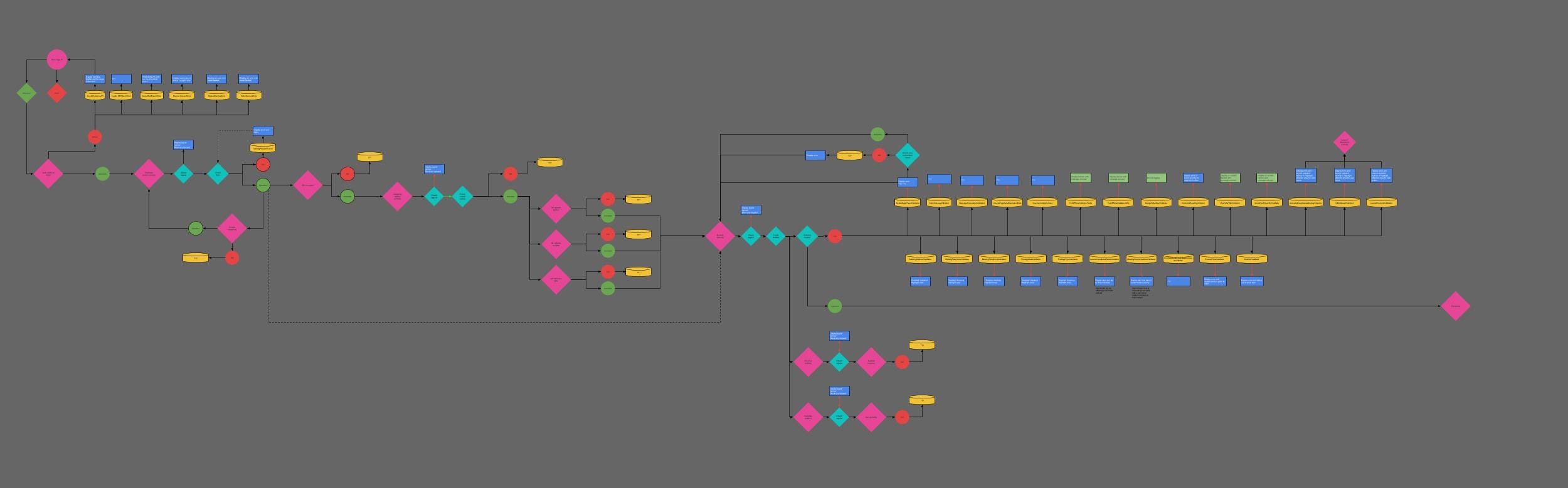
"Decision tree of the moonpig legacy system"
I then conducted several workshops with our engineers, product, and UX to understand what was the current situation, (mostly for the client-side). Was there any reusable element/component in the app? What would be the fastest way to develop such features? What would be the least disruptive for our customers? How could we keep learning as we build the new basket? How could we minimise the risk?
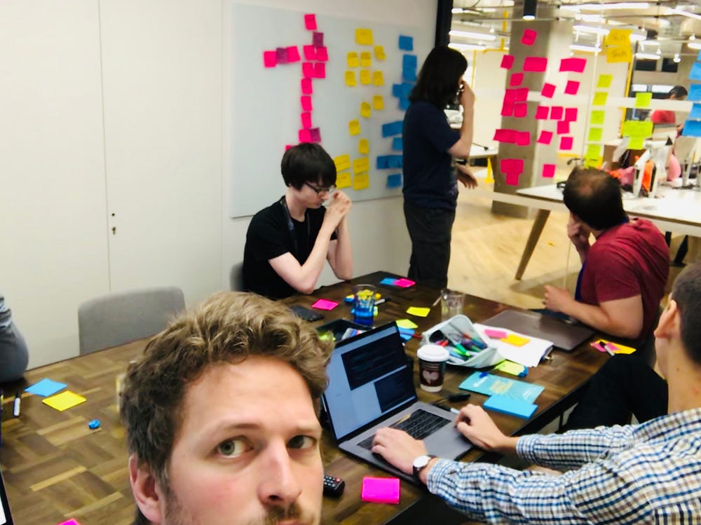
"Running an unpacking session with the squad"

"Running an unpacking session with the squad"
Both iOS and Android scratching their heads…
Soon after the answers were radical:
- Nothing could be reused.
- New endpoints had to be created and mapped onto the current backend logic.
- App architecture needed rethinking.
- Refactoring would be too long.
- Risk was high.
As we knew we could not offer fewer functionalities to users than the current live app, (considering the business constraints) and there was no way we could go offline for 6 months. We had to find a way to iteratively deliver those initiatives without disrupting the current app.
Designing a structure
Creating a shopping cart in e-commerce, unfortunately, might not be the most creative project you will have the chance to work on, throughout your career. Using our current behavioral data and loads of reading from the various website like the Nielsen Norman Group I created a map of the future user flow. Which we used as a visual token (using Google Drawings) for what we wanted to deliver. This document would be iterated on and used to map API calls and help engineers discuss implementations details and blockers. A living document to support our explorations.
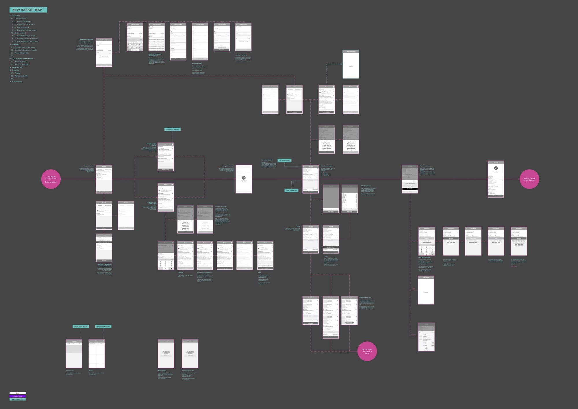
"Defining the system structure"
With a defined end goal, our senior engineers came back to us with their dev strategy.
"Iterative implementation at its best"
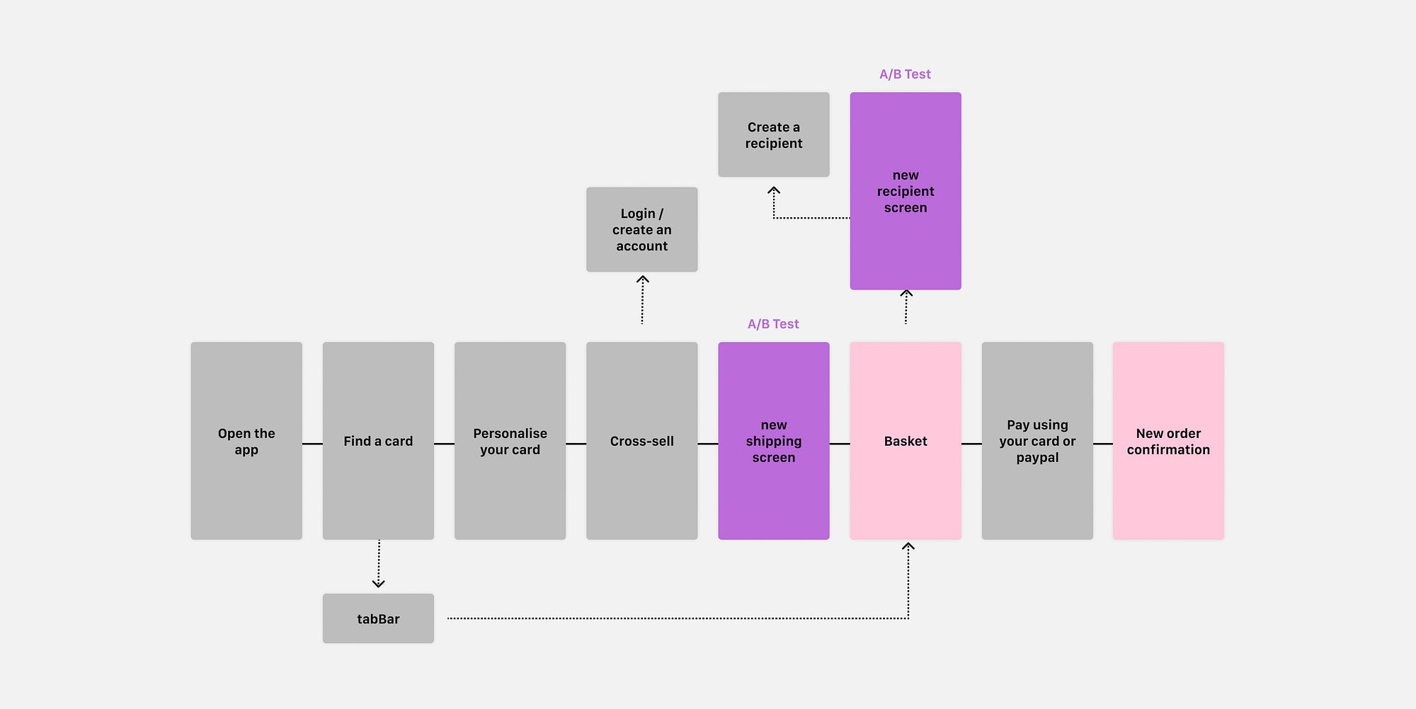
We would build and insert a new screen before "checkout" that would hit the new API and become the future basket, allowing them to work their way backward in the journey releasing one screen at a time and split testing each increment.

"one release had to have two new screens which we A/B tested against the current journey"
Having our user flow clarified and a release plan, I started focusing on the prototyping (using tools such as proto.io and Flinto) working throughout the journey (happy path first), one chunk at a time, and started gathering qualitative feedback from our users; each new prototype competing with the current live solution. The idea here was to uncover unknown unknowns and reduce the risks as we simplified our UI and introduced new interaction patterns.
- User adds a card, then a gift
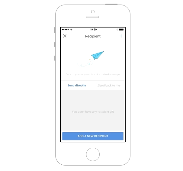
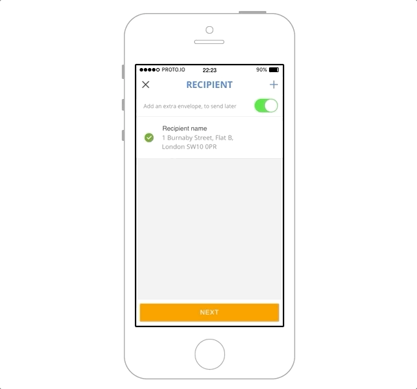
- Selecting a recipient
- Clarify the concept of direct recipient
- Selecting a shipping date
- Selecting a postal option
- Change a product option (i.e size)
- User adds two cards
- Users wants to send a card to his mum and flowers to his wife 🤯
 |
 |
 |
|---|---|---|
| Add a card, then a gift | Create a recipient | Pick a delivery date |

"Have a break, have a rebrand. As a little break in our project we had to deliver MVP1 (lipstick on a pig…)"
As the rebrand was happening, I kept building prototypes and testing micro-interactions, for handling edge cases, our micro-services had to offer. (handling errors for example…)
- User errors
- Network errors
- Validation errors
- Business logic errors I'm 🤬
"Every blue square is a potential error UX needed to handle"
The truth about legacy systems is that you don't want to work with them. Especially as a product designer, your whole mission is to solve problems, find shortcuts and optimise, to move faster. A legacy application will potentially do everything against those ideas. It is not built to scale. It was built for a reason of the past. As a result, making it do something it was not built for is a real challenge.
Release
We finally manage to release our new shopping cart. With the lack of time and other constraints, a lot of my work had been stripped out and postponed for further iterations. Lovable from a customer point of view, and viable to learn from, from a product point of view. The journey is connected on both ends and we have not changed too much the previous global journey. We released, under feature flag, a 50/50 test between old journey and new journey for 1 month to collect enough data to validate that our initiatives were driving the correct behavior.
Our users could now add as many products as they want to order. Moreover, at the moment they have their personalised card added to their cart, it is saved remotely until purchased or deleted.
As part of the results of the initiatives we noticed
- Users had a higher average order value +11%
- User used "continue shopping" after adding an item to their order.
- We fixed 60% percent of bad user reviews on the AppStore.

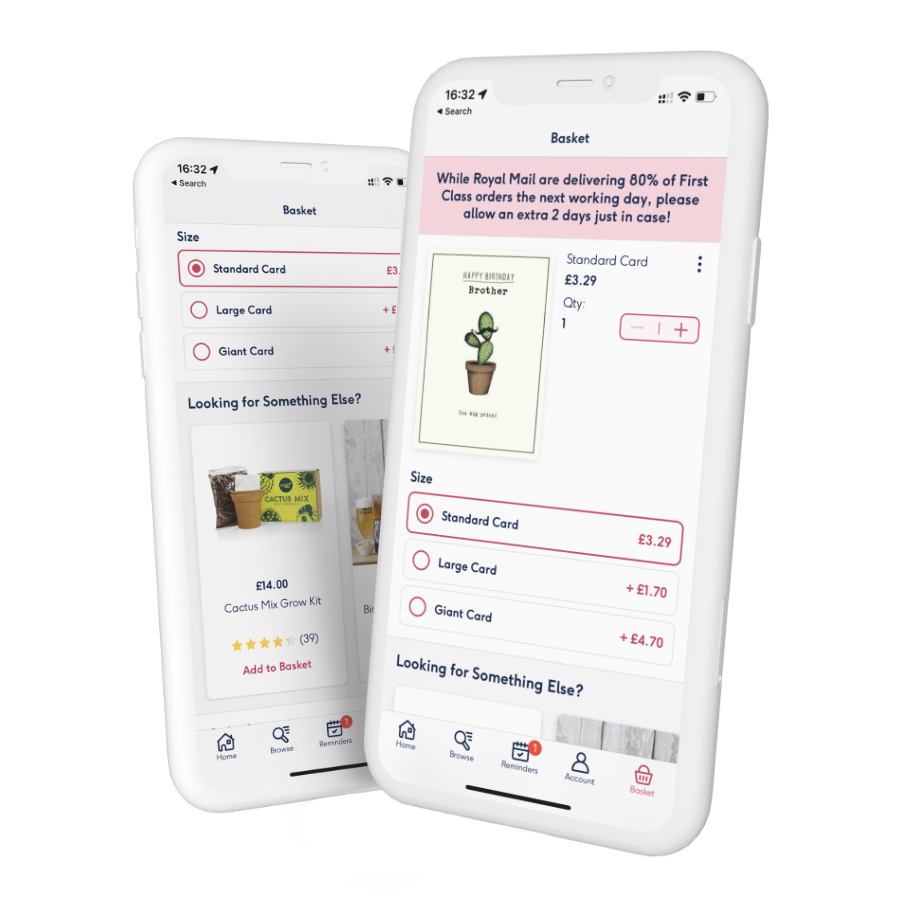
Current user flow on the iOS app
Now that our funnel was live, we kept looking at our GA event for user behaviors, We then started drafting hypotheses on how we would diverge from the current basket behavior to move towards a more traditional e-commerce basket.
A/B testing hypothesis
- Only 7% of our users change the shipping option. By skipping the shipping screen and making it optional, we will improve our conversion rate by XX%.
- Reducing friction when adding an item, should increase the number of items added to the basket and reduce the number of lost customisation.
- By Postponing the recipient selection to the moment of checkout we might increase our average order value.
- Allowing a user to preview their order before checking out will increase the conversion rate.
A future iteration of the basket
An iterative process that kept me busy for a long time. (9 months). Including inspiring meetings, intense discussions against de-scoping, and never-ending compromises between dev, product, and design. This was the real stuff.
Lessons learned
- The more deeply engaged a user is, the more likely to convert.
- Shopping carts should not be built in-house. They should be outsourced
- Providing less than other e-commerce competitors will cause issues. Amazon is the new standard
- Checkouts can always be optimised But is it worth it?
- Make sure when you start working on checkout that you have all pieces of the puzzle before even planning.
- You need a great team synergy to deliver such an initiative.