As a product designer and a Frenchman, working on one of the UK's most beloved and uniquely British products is very fun and incredibly challenging, and I'm grateful for the opportunity this has given me to grow.
The start
The UK is the one and only country that has a devotion to sharing greeting cards.
Birthday? -> Send a greeting card.
Promotion?-> Send a greeting card.
Your pet stopped peeing on the carpet? -> Send a Moonpig photo card.
The latest GCA Market Report shows that in 2017 the UK public spent £1.7 billion on greeting cards and buy more cards per person than any other nation — 33 each a year. Those are serious numbers for a frog eating designer.
Moonpig has a decent slice of that pie, but there is an everlasting problem, mostly related to the format of our service (online personalised card retail). A card with a typed message will not have the same impact than one written with your grandma's fountain pen!
Some of our customers would happily say: "oh, that's easy, I send it back to myself and because Moonpig is so great I have an extra envelope, to send it on or give in person" but unfortunately they are not the majority. 60% of our greeting cards purchases are sent directly to the recipient, therefore there was a great opportunity to explore, in order to bridge the gap and allow all distant and remote limeys to share their puns in the highest standards of writing. The problem was now clear…
How do you make a Moonpig card as personal and meaningful as a hand-picked high street card without touching it?
Digging
Our UX Researcher and I started running user interviews to identify what part of giving a card was making it the most personal.
The ink, the message, the lettering, the lines, the imperfections, the irregularities, the style, the giving moment? So many variables to investigate…
After meeting several card buyers, it became clear the opportunity was beyond personalising the card and adding your message to it; It was also how the message was going to be presented, received and perceived by the recipient. We explored what ideas we could easily test with a panel of customer which could help us prioritise and identify which path would offer an even more personal way to send greeting cards though our apps.
5 concepts came out of a brainstorming.
| Concept | Description |
|---|---|
| Handwritten by a professional | Type your message using your smartphone keyboard then select the desired style and a professional calligrapher will write your message in a unique and authentic way. |
| Realistic handwritten font | Type your message using your smartphone keyboard then select from our extended range of traditional and modern Handscripts, that will simulate a nice and graphic writing. Your message will then be printed to the card. |
| Picture of your handwriting | Write your message on a sheet of paper and take a picture of it when done. Our app will do the magic. Your message will then be printed to the card. |
| Handwritten by you | Write your message directly on your received card. |
| Written with your fingers | Using your device screen and your fingers, you can write your message from the tip of your fingers. Your drawn message will then be printed to the card. |
Learning and Validating
In order to maximise the confidence in our initiatives and reduce the risks of developing useless innovations, we ran a randomised survey with a panel of 500 recruited users ( customers and non-customers) from different demographics and made them rank, describe and explain each idea. The outcome then clarified many known unknowns and lead us to sharper ideas for potential new service proposition, all within a week.
The results were unanimous. Handwriting the message yourself was the preferred option. However, we knew already we would disqualify it, as we were targeting direct senders, and this solution would not be possible for them.
The final chosen option was the photo of your own handwriting, although we knew it would not be without constraints.
Product development
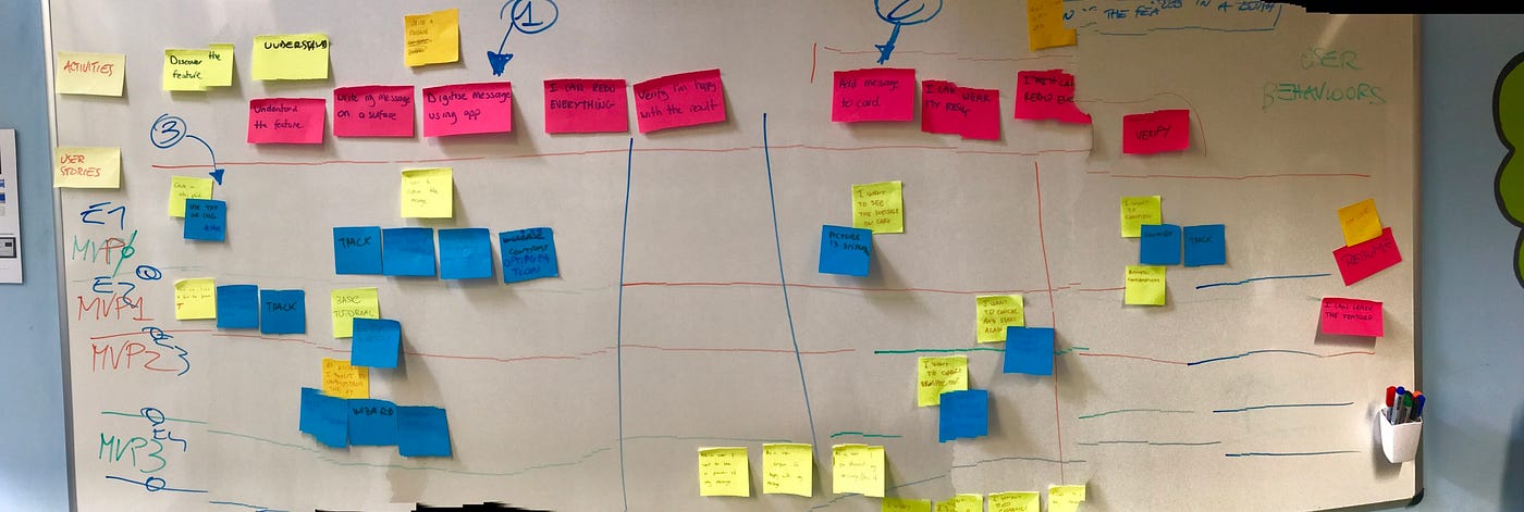
With the help of our engineers, PM and other folks from marketing we finally scopped our shippable versions and decided to move forward
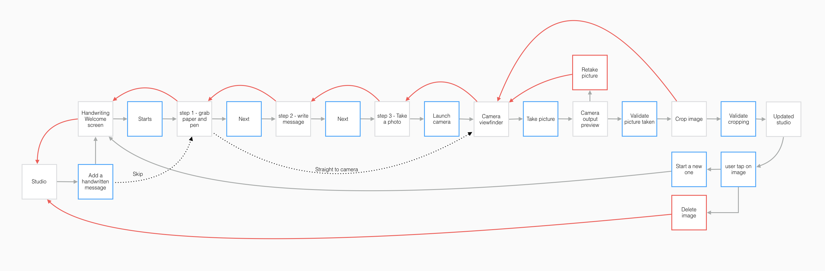
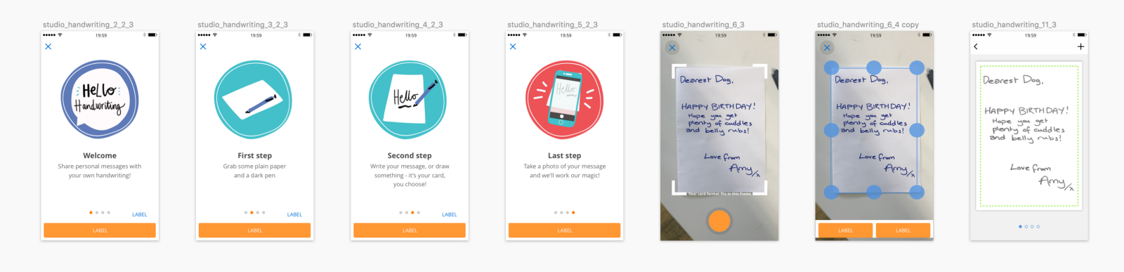
"When a user chooses the handwriting functionality and is on-boarded. A tutorial guides the user through the simple steps of the process."
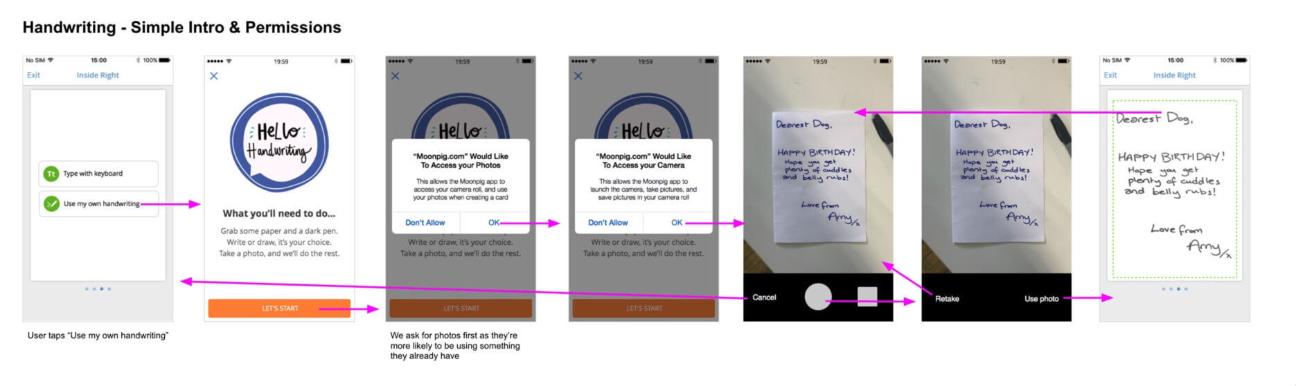
"simple permission request scenario."
As we all got excited, we all knew the biggest challenge would be in the image processing. Making sure any kind of message, would look contrasted enough and mimic to the highest level a real handwritten message. Would our devs be able to achieve such prowess? Why would we start building a feature that companies have made a standalone business off? The doubt was here, but the motivation still strong. As we still wanted to learn as much as possible about the technology, we started user testing similar apps like scannable, scanbot, iscanner, in order to uncover most of the usability challenges such feature could create.
"When a user chooses the handwriting functionality and is on-boarded. A tutorial guides the user through the simple steps of the process."
As we kept testing, we realised what beast that feature was, so many edges cases to cover; the angle of the camera, the colour of the paper, the colour of the pen, the thickness of the strokes, the light in the room… a UX nightmare clearly putting us in a very uncomfortable position.Several design iterations, 3 UX prototypes and a bunch of descoping sessions later, we had a beta running on iOS.
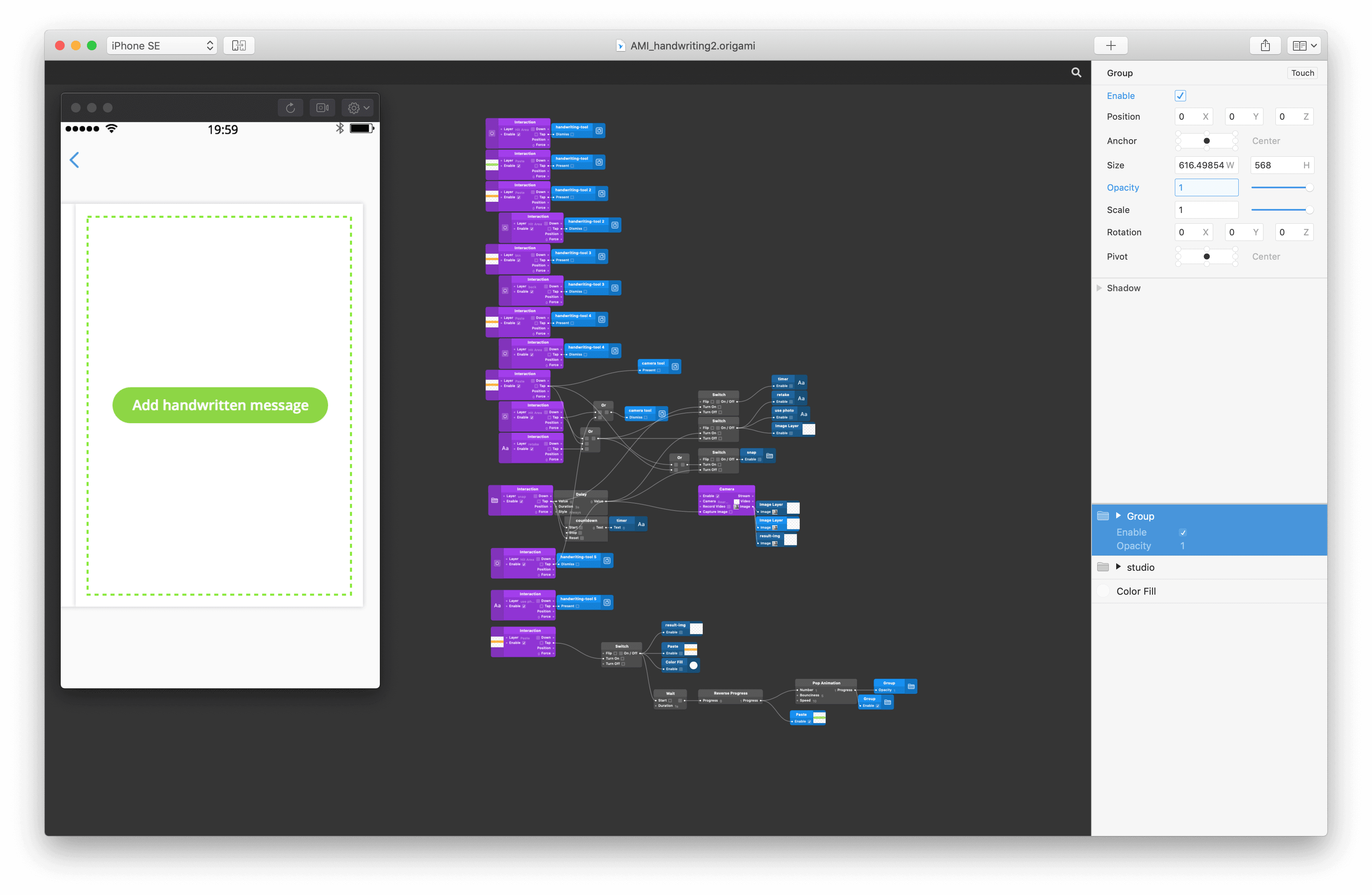
"Origami prototype for testing the experience"
The journey was complete but the algorithm needed tweaking. Weeks went by and the tension was high, I had stopped working on the project and was exploring our online retail competitors to shape what was going to become our multi-item basket.
Finally! The secret recipe for the image treatment was ready, our tech lead was satisfied and the success rate was high enough for the feature to go live. ( behind a feature flag. ).
As of today, 1/3 of our send direct user use the handwriting feature and although it could have benefited of more TLC it helps users everywhere in the world to be a bit more personal when they celebrate with their kin.
Here is a video of handwriting in our current live app.
Lessons learned 👨🏼🎓
- A product never really lands where we initially wanted
- The aesthetic of a feature does not directly correlate with user adoption
- You don't need to build something in order to learn about it
- In a small team, do not overwhelm engineers with low-level problems
- Be clear with the outcome expected and let the music play
- A product is never finished, like a pet, you will always have to give it TLC
- Make sure your stakeholders are on the same planet as you