Situation
Moonpig has had a rebrand, which was lead by the brand and marketing team. Their goal was to refresh the identity and move away from other competitors. Delivering the new brand across all our products is a complex task. We have released the first iteration with new identity and colours (our MVP) and now we are getting ready to deliver the full rebrand as part of our new platform project.
Task
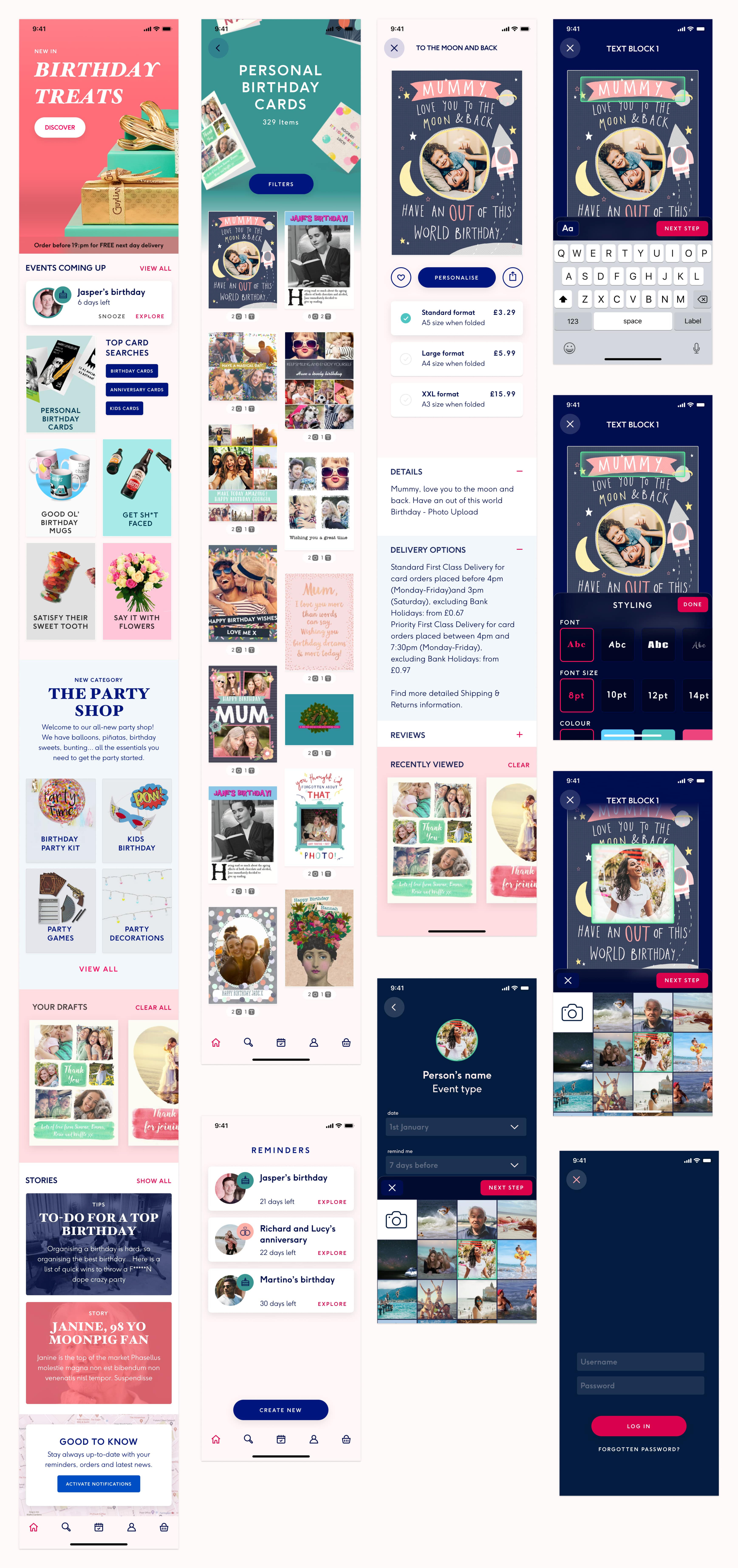
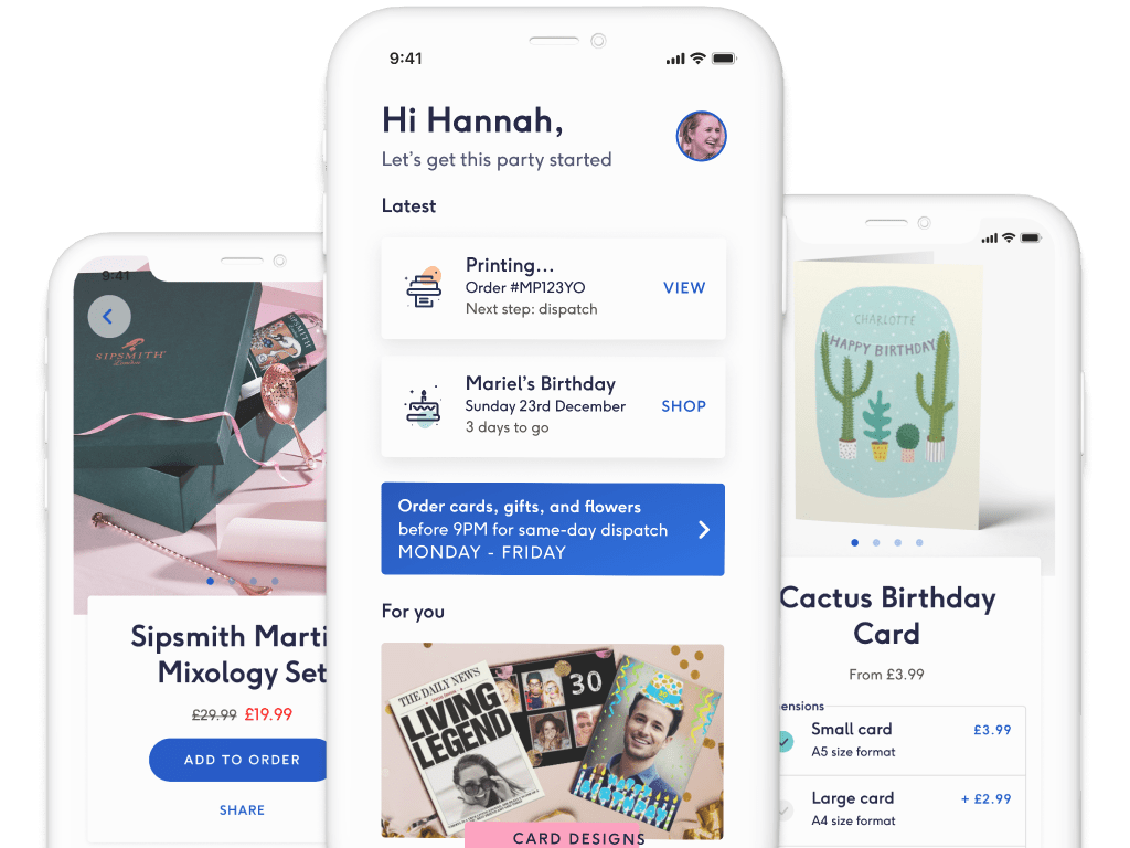
The design team was given a free pass to reimagine what could be the new Moonpig experience. Each designers of the team was given two new colours and tasked to re-design the interfaces for key areas of our product. The concepts would be presented to stakeholders and tested with customers. This task aims at building solid foundation for our design system.
Action
First I started looking at successful e-commerce apps and other design trends and mapped out what makes a great app experience. Split into three milestones I delivered 3 visual concepts with all UI element and content. I then presented them to the team and key stakeholders.
Result
My concepts has been used by senior management to present to the board. Each of my delivery influenced more junior designers in their next delivery. It also increased the focus on the apps throughout the company Out of the 6 final concepts delivered by the team, my last delivery is part of the two concepts we will test with customers and used as the base for our design system.
First iteration
The first milestone was a very conservative concept. Using current assets from marketing.
Walkthrough
Interfaces

"undefined"
Second iteration
The second brief was to go way more ambitious. So we paired between designers and went back to the core of moonpig and what people love about us. As well as combining the talents of the card design team to inovative mobile patterns. This concept was targeting the younger part of our demographics.

"We presented the idea, created a story around where we went for inspiration and we thought about it"
Walkthrough
Interfaces

"We presented the idea, created a story around where we went for inspiration and we thought about it"
Last iteration - Design Library
Two routes were selected in the end. And I was given the task to merge and standardise our UI to use a foundation for our design system. Now focusing on the layouts more than the content, I meticulously created the components for our new style. The goal was to build robust and scalable components that any designer could use throughout a Figma shared library

"We presented the idea, created a story around where we went for inspiration and we thought about it"
